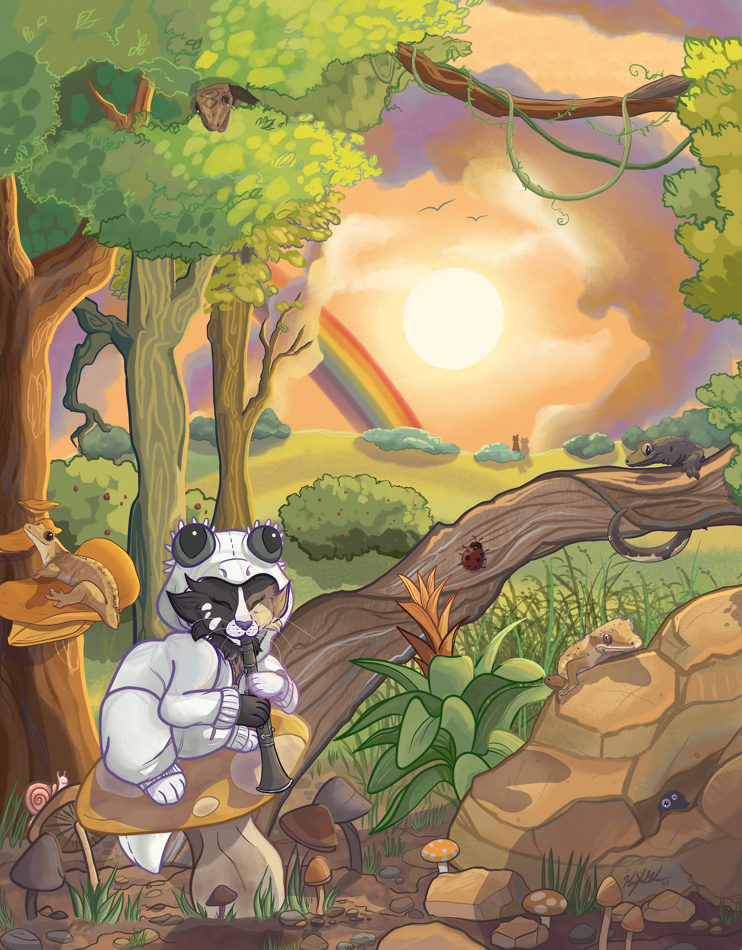
Although this year I had other big priorities, pet portraits remained what I am most known for. I love using various media to make commissions great and small. It’s great being able to connect to others through our shared love of animals.
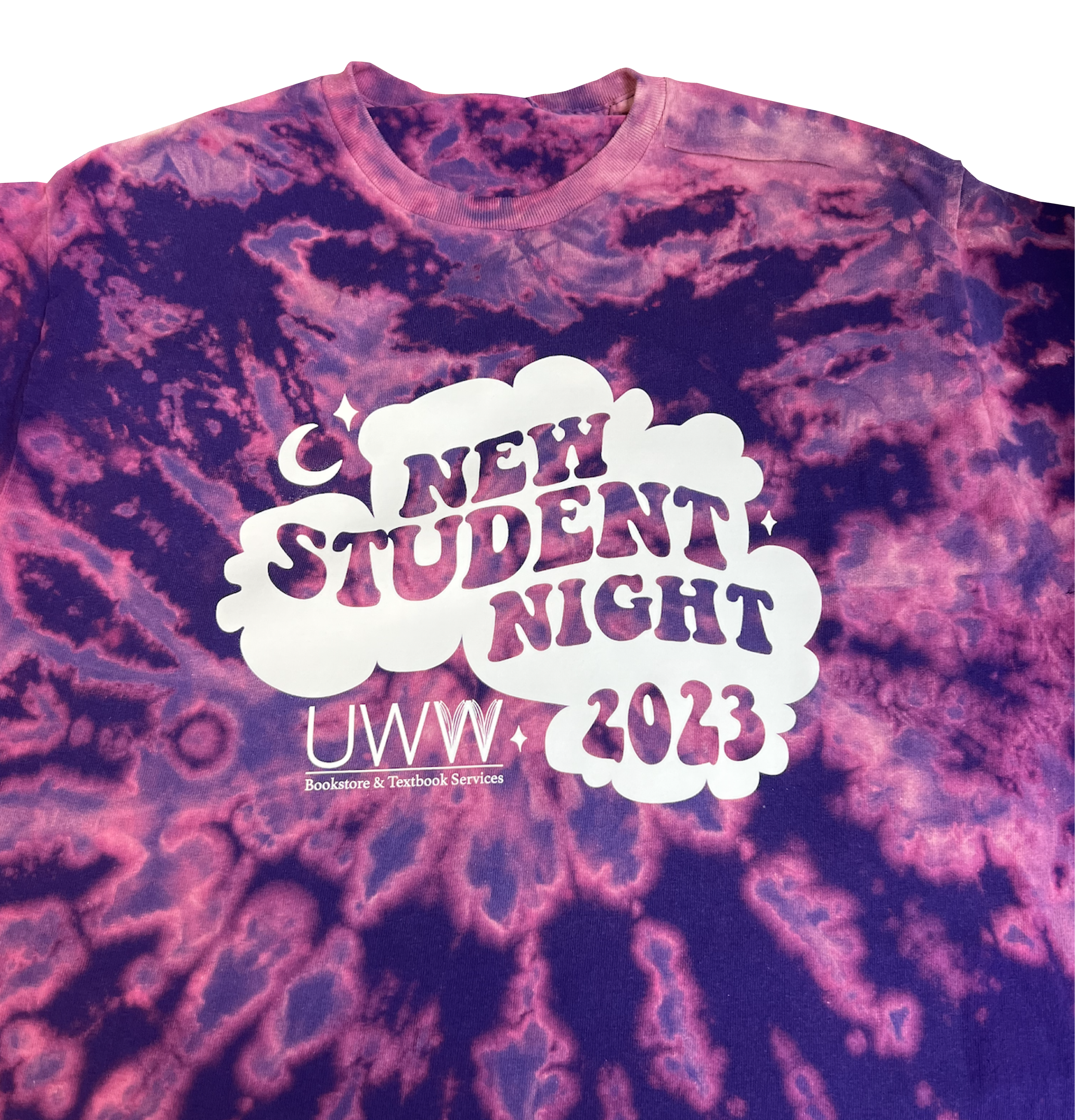
In May 2021 I was hired as the Coordinator of the brand-new Custom Shop on campus. I was given an empty room and some vague goals, and became responsible for getting the operation going and ready to open in the Fall. The idea is to offer completely customizable products and design services so clubs around the school can have their own merchandise, but it is open to the public as well! You can find the order form here and purchase existing designs here.
2020 became the most successful year thus far for my pet portrait business. Clients found me on the Internet and at in-person events, asking me to bring their animals to life on paper. Images were made with both digital and traditional methods. Some of the poses and backgrounds were photo-referenced at the clients’ request, but most came from my imagination. I pride myself on my ability to recreate a diverse array of species, bringing awareness to pets that aren’t just dogs or cats.
Date: Fall 2020
Media: Ink and Adobe Photoshop
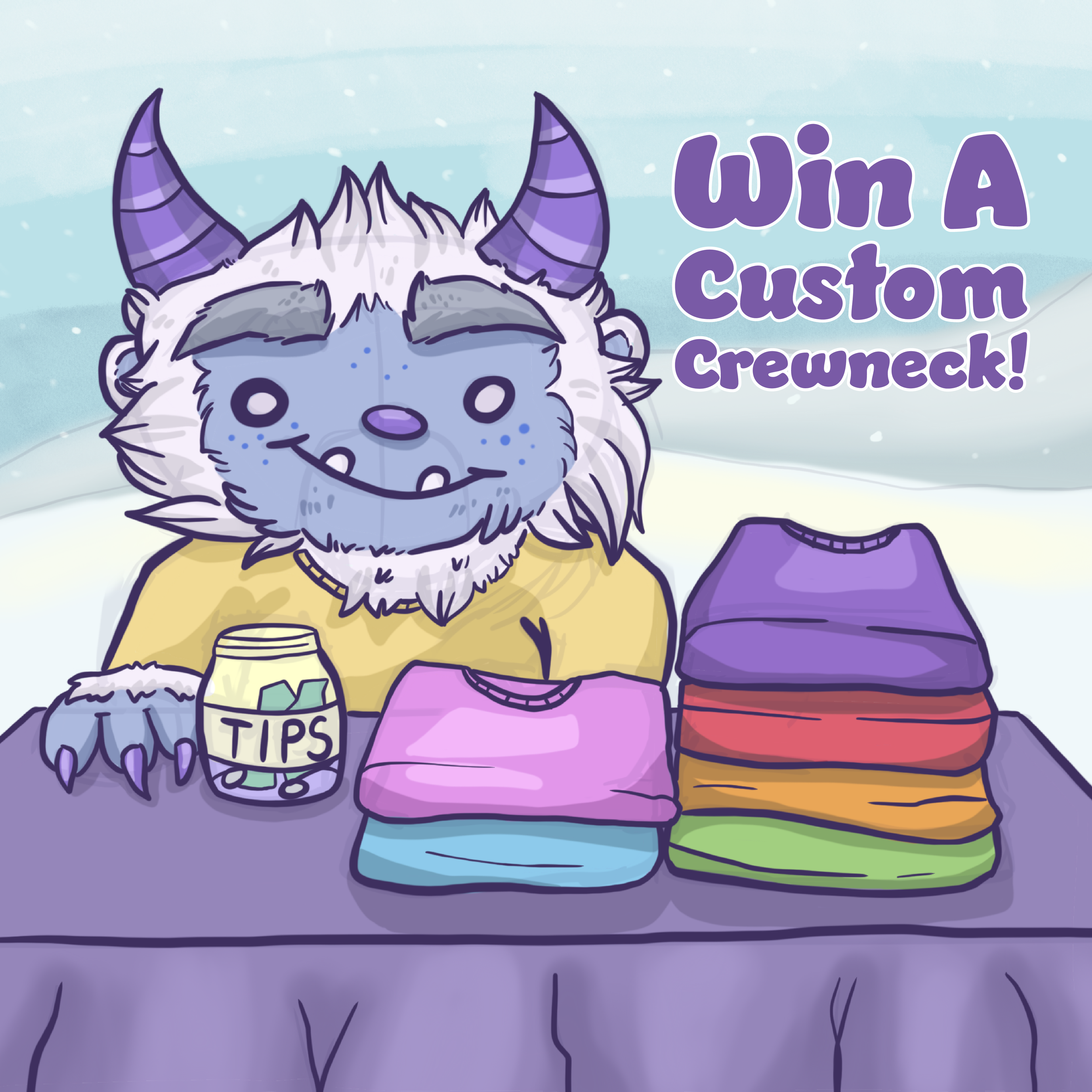
Concept: A good friend who works in the bookstore at the University of Wisconsin-Whitewater reached out to me with this project. The goal was to start collaborating more with alumni of the school, like myself, and promoting their work. I was asked to create a square Halloween image to promote a social media contest, as well as a card that would be sent to the contest winner. The image should contain multiple diverse characters and imagery to reflect an inclusive and fun environment. Specifically she mentioned characters of different ethnicities, a character in a wheelchair, and maybe a rainbow for the LGBTQIA+ community.
The main challenge of this piece was to fit all the required elements into a relatively small picture that most people would see on their small phone screens. It required a lot of preliminary planning as well as constantly checking in with my friend for feedback and tweaks.
The card for the winner was a much easier feat once we figured out what we wanted to do. I suggested sticking to a spooky color palette and drawing multiple Halloween-themed elements around a message.
Date: Summer 2020
Media: Adobe Illustrator
Concept: I submitted this logo for a client-run contest on 99designs. Jane wasn’t sure what sort of illustration style she wanted, but she knew it should be something inspired by mermaids due to her passion of photographing the sea. She determined that she liked my entry and declared me the winner. We then worked closely to create her perfect look by playing around with different colors and compositions. Later I also designed her a business card to match, with free reign to explore any ocean-inspired theme.
Unique challenges of this piece included creating a compelling composition as well as being flexible and working actively with the client’s changing ideas. I tried to be creative and playful in making the icons for the back of her card so she had something unique that represented her business well.
Date: Spring 2020
Media: Acrylic/Oil on canvas
Concept: This piece falls under the “personal therapy” category. I struggled for a couple years with hostile work environments and a difficulty in expressing big ideas in my small world. This shark was an image that kept popping into my head, and creating him was incredibly therapeutic.
A Great White has never been successfully kept in captivity, partially because of their wild spirits being crushed, and partly because their specific gill structure requires them to constantly swim forward to breathe properly. I think at some point everybody feels like they’re stuck in place and struggling, and I think it’s important to make art about these moments so people feel understood.
Date: Fall 2017
Media: Oil on canvas
Concept: A friend reached out to me in search of artists to assist her in a decorating project. She was tasked with brightening up the cafe area of the Milwaukee Public Museum with artwork- particularly whimsical pieces that combined cafeteria food with museum exhibits.
When I spotted an empty area of wall space directly above the cafe’s ice cream freezer, I simply knew I had to do an Ice Age-themed painting. The fun pinks and blues of this piece are meant to inspire a sweet tooth and the childlike fun that I associate with museums.
Date: Summer 2018
Media: Ink, Photoshop
Concept: A “just for fun” self portrait stemming from one of my strange dreams.
Date: 2017 - Present
Media: Graphite, watercolor, ink, acrylic, colored pencil, etc
Concept: I have been taking commissions for a few years now, with portraits in this style always being a popular seller. One of the most beautiful things I get to do as an illustrator is to immortalize someone’s beloved pet or bring their ideas to life.
These projects have also taught me a great deal about customer service, paid and unpaid advertisements for my work, and how to create a positive personal brand.
Date: 2018 - Present
Media: Ink, Photoshop
Concept: One of my personal artistic goals is to remain active in the community and start conversations around my work. For a few years now, I have been posting to my Instagram account on a regular schedule, building connections and sparking interaction.
Digital pieces like these make common appearances on my social media. They’re quick and efficient to create, and their bright, smooth colors draw viewers in.
Some of these drawings are of my own invented characters, while others are pet portraits and commissions. Many clients do opt for digital drawings because there’s no need to mess with shipping.
Inktober is an annual art challenge invented by illustrator Jake Parker. The goal is to create an ink drawing every day of October- preferably following the given spooky prompts- in pursuit of self-improvement and community building. A simple Google search yields endlessly diverse contributions from all kinds of global artists.
For me, this challenge is a way to test my time-management skills and creativity. I always try to come up with something different from everyone else, and it has to be FAST too. Although they’re not my most technically advanced drawings, I think they mean so much in terms of my dedication as an artist.
Date: May - July 2019
Media: Watercolor, ink, colored pencil, digital
Concept: After speaking with some professionals about career options, I decided to design some physical products for a more diverse portfolio.
First, I was advised to create a set of bathroom decor because of the diverse textures and techniques I could play with. I spent many hours researching decor trends and popular colors as well as trying to figure out stylish but playful imagery. Although I had to narrow down a few ideas, the image that kept popping into my head was that of succulents. Colors like yellow and pale green are in right now, especially in bathrooms. Textures like exposed wood and terra-cotta are also trendy, making this the perfect idea. I personally also love decorating my spaces with plants because they make everything feel fresh and alive. After I had my idea and some sketches, I designed a shower curtain and rug in watercolor and a soap pump in Adobe Illustrator.
The next project I wanted to work on was a set of decorative pillows. Again, I played with a few concepts, including various foods and cute monsters. In the end, an environmental theme stood out to me because Earth Day occurred near the beginning of the project. I called upon my social media audience to discuss with me what environmental issues and endangered animals personally mattered most to them. After doing this “field research” and learning more about popular colors and patterns, I had my ideas.
1. Polar bear: As the poster child for the dangers of global warming, I think most people now see polar bears as precious resources. They’re adorable and make for cute products, but now more than ever, they actually mean something. I gave my polar bear big, intelligent eyes and grass accessories to symbolize how the creatures are forced to eat arctic plants as their usual diets become more and more inaccessible. I also used a teal blue background, which is a very hot decor color at the moment (pun intended).
2. Planting trees: I was told by professionals that hand-lettering is an especially valuable skill in product design, so I knew I wanted to illustrate a quote for at least one of my pillow designs. This quote by the old English author Thomas Fuller stuck out to me as important, yet accessible enough for people to want in their homes. I thought illustrating different tree seeds could also be cute.
3. Giraffe: Another animal I knew I wanted to illustrate was the giraffe. In current events, the US is debating over whether to include giraffes on the endangered species list. They’re also popular animals that I’ve seen on countless goods in stores. I found the quote, by Romantic poet John Keats, through social media friends.
4. The final but most colorful pillow I designed depicts the Spix’s macaw, a bird now considered extinct in the wild thanks to deforestation and the pet trade. Around the macaw’s neck is a string of seeds and cactus fruits: the natural foods that these animals need but can no longer find.
I also did some T shirt designs. My professional contacts especially wanted to see shirts targeted at young girls with images like cats and unicorns. They also requested a more painterly, “lineless” style to show that I could do both graphic and more organic looks. I did these with watercolor and soft colored pencil to achieve this look.
In this chapter of my journey, I heeded the advice of a professional contact and learned how to create repeating patterns (such as for textiles), then spent time practicing and pairing them. I also conducted research (via interviews, Instagram polls, and reading articles) on the interests and fashion choices of my target audience: tweens. There were a few trends I noticed that I decided to keep in mind while putting together these just-for-practice designs.
Humor means a lot to them. This makes sense to me, having been around internet kids and their memes for a long time. They love puns, particularly paired with imagery like cartoon animals. (Side note: Cats. Cats cats cats.) They also delight in silly concepts that don’t necessarily make sense. A particular example that comes to mind is an old painting of mine- “Mango With a Nose.” It gained a sort of following with the kids for no reason whatsoever.
Fun, pastel colors were repeatedly mentioned in my talks, especially when complimentary pairs. Pink and pale green is a winning palette, as is blue and pale brown. Tweens told me that they do like brighter colors on some special statement pieces, but pastels are preferred because they are easier to layer and style.
I was also told that simple shapes are typically better (I would assume because they’re easier to recognize from any distance?). As an artist, I love a lot of variation and interesting detail, so simplicity is something I’ll still be working on in future projects.
Date: Spring 2017
Media: Oil paint on three canvasses
Concept: A three-paneled painting illustrating three monsters that creative people often face and strive to overcome.
The "Greed" monster is adorned in fine jewelry, yet its many eyes are constantly looking for more riches than it can realistically hold. Meanwhile, its eyes and fur begin to change color as it loses itself in its quest to become someone else.
The "Procrastination" monster is unable to move due to its chains of fear and the giant clock hands piercing its skin. It wears an hourglass and a compass to symbolize the time that it has wasted and the path that it has lost. Its one blank eye relates back to the tradition of the Japanese Daruma doll. The doll's blank eye can be filled in only after the owner's goal is completed.
The "Perfectionism" monster possesses a lovely spotted pelt, but it sees the spots as imperfections and hides in shame behind a heavy wooden mask. This mask, however, has become dirty with ink, proving that nothing can truly be kept perfect. This idea is also highlighted by decaying flowers, and a cage-like necklace emphasizes the "trapped" feeling that a perfectionist may experience while trying to make creative work.
Date: June 2018
Media: Adobe Illustrator
Concept: I have a tradition of redesigning my old social media icon every so often to see how my vision and skill has progressed. The character pictured is called Ciryl, whom I first started drawing in high school to represent myself because I wasn’t secure with the human form back then. Now I can draw anything I set my mind to, but still Ciryl has stuck.
Date: Fall 2016-Spring 2017
Media: Adobe Illustrator
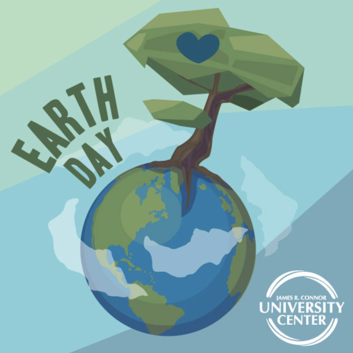
Concept: One of my responsibilities at my University Center job was to create social media images celebrating various holidays (some of them traditional holidays and some of them offbeat celebrations). It was quite the open-ended project, allowing me to explore new techniques and have fun with unexpected and creative artwork.
Date: 2016 - 2017
Media: Adobe Illustrator
concept: As a designer at UW-Whitewater's University Center, my responsibility was to brainstorm and create materials advertising various campus events. Different areas of campus were treated as different clients, all with their unique design needs and preferred styles. For example, Warhawk Alley, our go-to place for bowling and gaming, always asked for bold, colorful, and innovative designs. Meanwhile, crafting and gallery events used lighter, more whimsical colors.
After making an event poster, I was also usually asked to translate the same design into different formats, like blog banners, cover photos, social media images, sandwich boards, and table tents.
Date: June 2016
Media: ink, marker, colored pencil, acrylic paint, Photoshop, and InDesign
Concept: What started out as a class assignment to turn a news article into a magazine layout quickly became a personal exercise in style exploration. Inspired by the author's vivid imagery, I decided to brighten the page by including my own illustrations (both digital and hand-drawn) rather than stock photographs.
The finished product represents what I love most about designing- the freedom and fun that should fuel it. It also was one of the first times exploring the “monster” theme that I would constantly revisit in my art.
Date: February 2017
Media: Adobe Illustrator
Concept: On a whim, my supervisor at the UW-Whitewater University Center decided it would be nice to design Valentine cards to hand out to passing students. However, she was completely unsure how the project would work, and handed it off to me because of my out-of-the-box thinking and time-oriented attitude.
With only two days to work, I brainstormed two designs. I then printed, cut out, and taped candy to hundreds of cards. To this day, it is probably one of my favorite projects from that job and stands as an example of my work ethic.
Date: December 2015
Media: Acrylic on wood panel
Concept: A final assignment in painting class, this piece is supposed to convey my vast knowledge of painting techniques. It includes opaque painting, glazing, and everything in between.
The subject matter and reference image are from the Dreamworks movie How to Train Your Dragon 2. Even as an adult, it's one of my favorites.
Date: Fall 2016-Spring 2017
Media: Adobe Illustrator
Concept: One of many projects I was assigned as a designer in the UWW University Center was to work side-by-side with marketing students and help bring their visions to life. They would write, publish, and promote blogs, and I would create images to make them intriguing and clickable on social media.
Date: Fall 2016
Media: Paper quilling
Concept: For this school assignment, I pretended to be a designer for an old-fashioned toy store. This imaginary place included hands-on toys (like crafts and blocks) rather than electronics.
The project was to complete a creative typographic installation to reside within the store. Inspired by the pages of books, I decided to use paper quilling. I thought about how children love finding creative imagery in completely unrelated places, such as clouds, and created a work that would prompt a kid's mind to wander in a similar way. The abstract swirls of colored paper look like something different to everyone- perhaps dinosaurs or flowers.
Although the finished image depicts the work installed upon a wall, my vision is for it to lay flat against the ceiling so that a child might discover it while playing and laying on the floor as kids often do. I was able to actually install the project on the ceiling outside my school’s painting studio for several weeks.
The second objective, brainstorming a logo for the imaginary company, started with the same idea of finding hidden imagery. Here the o and the n in "wonder" become a door opening to a new and creative world.
Date: 2016
Medium: Watercolor, colored pencils, and ink on watercolor paper
Concept: A personal, “just for fun” piece based around one of my oldest original characters: a feral, city-dwelling cat named Letu. My goal was to convey a feeling of cocoon-like calmness in the midst of a busy and messy world. To me, it symbolizes a haven from anxiety and stress.
Recognition: This piece earned a merit in UW Whitewater’s Spring 2017 Senior Show. This labeled it as one of the most successful pieces of all the graduating seniors in my class.
Date: October 2015
Medium: Acrylics on paper
Concept: One of my earliest acrylic paintings, done as a college assignment to better understand the properties of light and color. I first did a monochromatic underpainting and layered colored glazes over it.
Recognition: This piece was selected to be featured in UW Whitewater’s 2016 Juried Student Show, where it competed against other acrylic paintings.
Other: Reference image from stock photo account “Quiet-bliss” on deviantART (used with permission)
Date: March 2016
Concept: A college assignment aimed at giving students the experience of working with a real-world client to create a professional final product. I responded to a design brief given to me by the fictitious "Papa Parmigiano," and kept his target audience in mind when creating his logo, color palette, and website.
The site's design is mobile-optimized and fully functional. All vector graphics were made by me as well.
Date: August 2017
Concept: The site that I previously used to showcase my work was an immense project in itself. It was coded fully from scratch, with every button, graphic, and icon completely hand drawn. It was in a long-scroll format with simple animations. The goal was to have a portfolio website as creative and original as I am, and I loved it.
However, the amount of work and coding it took to make even small updates just wasn’t sustainable for me during that busy time in my life, so I thought it best to make something new.
Date: Spring 2015
Media: Branches, found scraps of cloth, paint, power tools, beads, twine, and much more
Concept: We were challenged in a 3D design class to build and present an installation out in the world. It was meant to be visually pleasing, but the real art of it was in how the community interacted with it and what viewers got out of it.
Our team eventually settled on building a glorified fort, which we later transported to an elementary school that had a rather sad and barren playground. We gave a presentation to the children on the importance of creativity and outdoor play, and we brought along paint and fabric materials so they could add onto the structure that we started. The project was even immortalized in a local newspaper.
Perhaps needless to say, we received a stellar grade on our project.